Grid CSS
What is CSS Grids?
CSS Grids is a new standard in CSS3 and is slowly being adopted by all web browsers. Creating a basic website like this one requires a few lines of CSS, for example:

And the CSS:
.wrap {
    border: 5px solid red;
    height: 400px;
}

.main-content {
    width: 45%;
    margin-left: 1%;
    height: 98%;
    float: left;
    background-color: aqua;
}

.sidebar {
    width: 45%;
    margin-right: 1%;
    height: 98%;
    float: right;
    background-color: crimson;
}
Grid creates a grid inside a div element (Think of lines between the space in the image below).
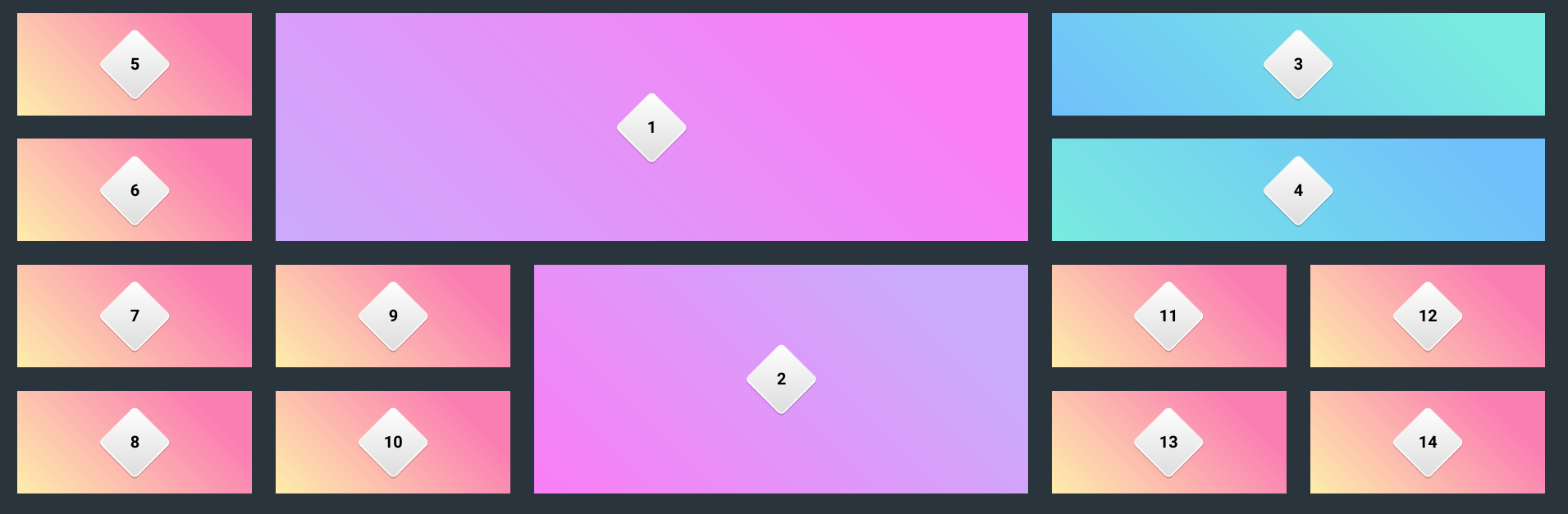
We can decide how many rows and columns we create as well as the gaps between them. Any child elements we have (We can’t align child-of-child elements into a grid, but we can make new grids in elements already aligned to a grid) can be aligned into this grid, which eliminates thinking about designing sites with dozens of wrappers and placing elements inside boxes inside boxes.
.wrap {
    border: 5px solid red;
    height: 400px;
    display: grid;
    grid-template-columns: 1fr 1fr;
    grid-template-rows: 100%;
    grid-gap: 10px;
}

.main-content {
    margin-left: 1%;
    grid-area: 0/1;
    height: 98%;
    background-color: aqua;
}

.sidebar {
    margin-right: 1%;
    grid-area: 1/2;
    height: 98%;
    background-color: crimson;
}
This does the same thing.
What we are doing here is making a grid with 2 columns and one row, then setting the columns size to 1fr which is 1 fraction of the available space
The Grids example above looks quite ugly as you can imagine working with column/row numbers in grid-area will get complex after just a few, so next we can look at naming the layout sections for ease of use. Below is a mockup site made with grid-template-areas.
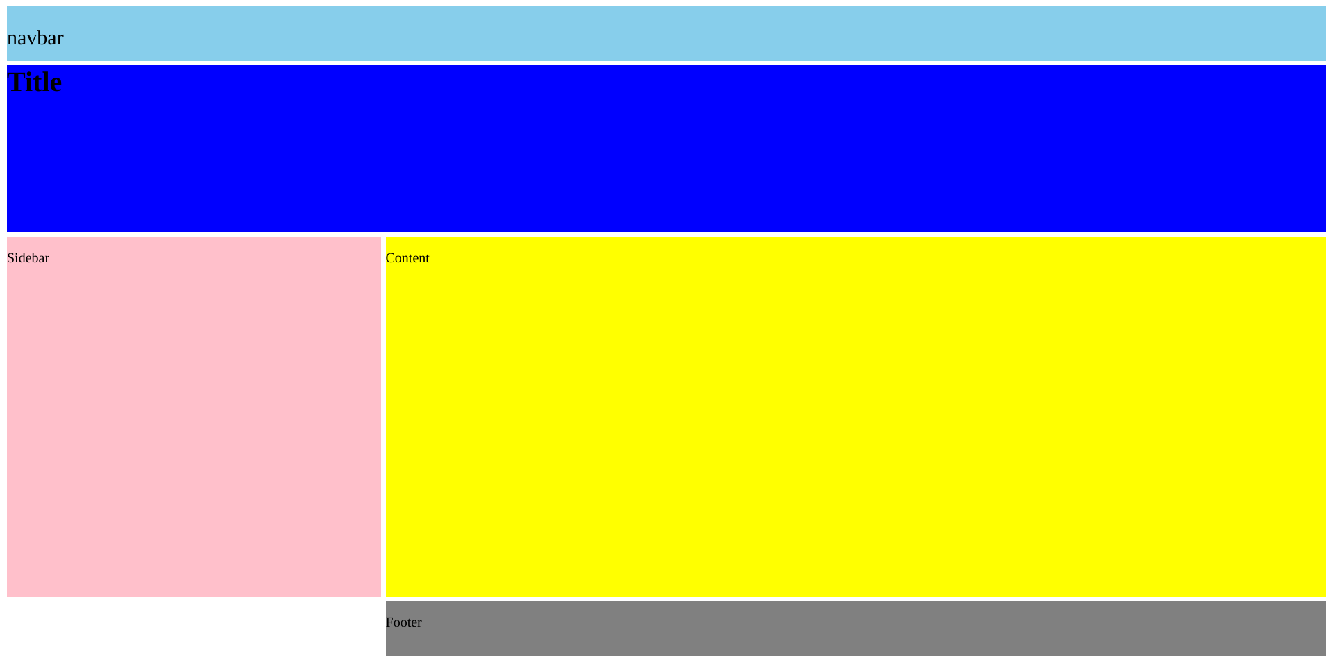
And the CSS:
:root {
--grid-gap: 5px;
--font-size: 1em;
}
p {
font-size: var(--font-size);
display: inline-block;
}
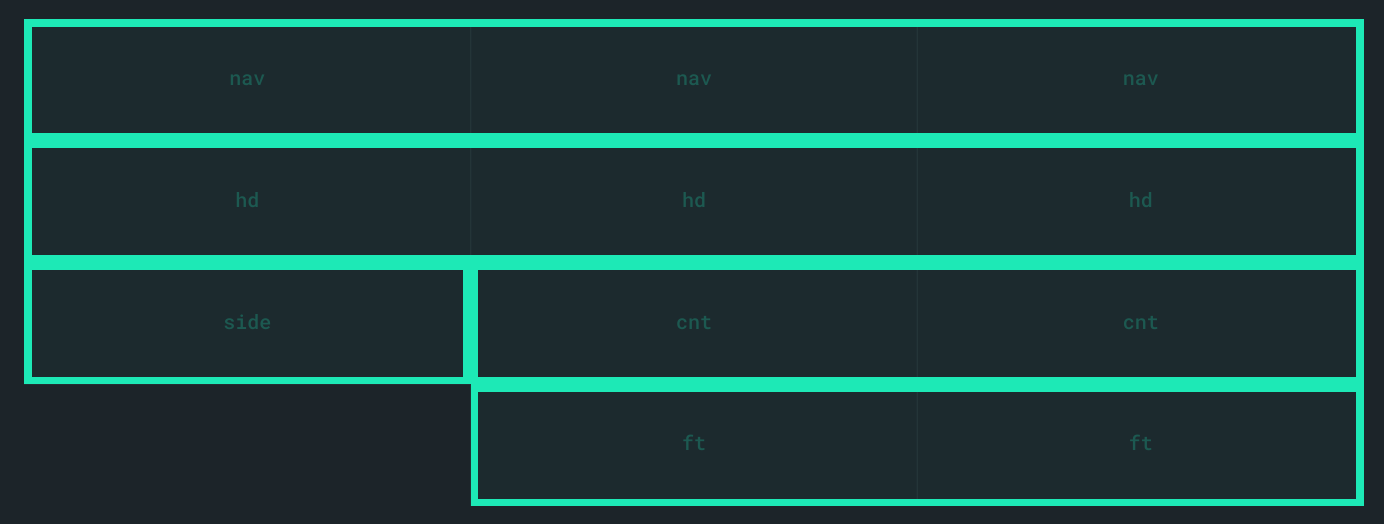
#wrapper {
display: grid;
grid-template-columns: 2fr 4fr 1fr;
grid-template-rows: 4em 12em auto 4em;
grid-template-areas:
"nav nav nav"
"hd hd hd"
"side cnt cnt"
". ft ft";
grid-gap: var(--grid-gap);
height: 100%;
}
.header {
background-color: blue;
grid-area: hd;
margin: 0 0 0 0;
}
.sidebar {
background-color: pink;
grid-area: side;
}
.navbar {
background-color: skyblue;
grid-area: nav;
--font-size: 1.5em;
}
.content {
background-color: yellow;
grid-area: cnt;
}
.footer {
background-color: grey;
grid-area: ft;
}
Using grid-tempate-areas we can label specific areas of the grid, such as column 1/3 and row 2/4 as “content” so then we can just flow an element to “content”, formatting the grid-template-areas in CSS using multiple lines makes the layout much easier to grasp at a glance, below is an example of how this works
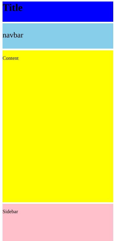
Once grid-template-areas is setup we can use grid-area to place an element inside the defined grid section, since we are using fractions and em’s our page will flow to the size of the browser, if we want to change anything for mobile users or landscape/portrait screens we can just edit any of the CSS we have been using, we can re-size with grid-template-rows/grid-template-columns and we can move and re-arrange the site with grid-template-areas (This is preferred vs re-naming an elements grid-area)
@media (max-width: 550px) {
  #wrapper {
    grid-template-rows: 4em 5em 30em 22em 4em;
    grid-template-areas:
    "hd hd hd"
    "nav nav nav"
    "cnt cnt cnt"
    "side side side"
    ". ft ft";
  }
}
Mobile Version (hidden bc of size)
From looking at the below image, CSS Grids has only recently gained support in browsers other than IE and Edge (these both lack proper support for Grid) so only users with up to date browsers will be able to properly see your website (Still well over 60% of users). If you want to start building a CSS Grids website now you can put it all inside a @supports (display: grid) {}
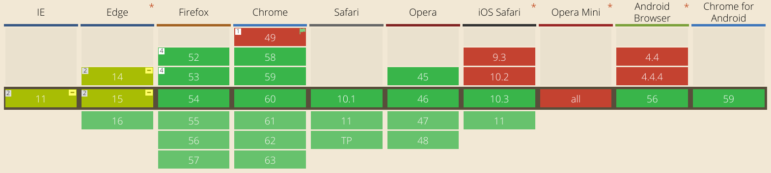
There is an issue here, however. Both IE and Edge will say they support CSS Grids, but instead they support an older creation of grids which is quite different from the current one so some javascript will be required to ensure your site doesn’t attempt to display in these browsers.
Sauces:
Thanks to Morten for teaching me about Grids and the awesome speech
Codepen for the CSS Grids picture (has a flexbox fallback)
Awesome codepen for a visual interface when making grid-template-areas